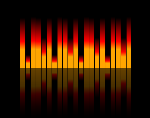
DEMO: http://codepen.io/html5web/pen/spbGi 
body{
  background: #000;
  width: 360px;
  padding: 20px;
  margin: 0 auto;
}

.equalizer{
  width: 100%;
  height: 200px;
  transform: rotate(180deg);
  -webkit-box-reflect: above 1px -webkit-gradient(linear, left top, left bottom, from(rgba(0,0,0,0.4)), to(rgba(0,0,0,0)));
}

.parts{
  background: linear-gradient(orange 35%, red 50%, black 95%);
  width: 15px;
  height: 0;
  display: inline;
  float: left;
  margin-right: 2px;
  animation: play 1s infinite ease-out;
 }

.parts:nth-child(2){
    animation: play 2s infinite ease-out;
}

.parts:nth-child(3){
    animation: play 4s infinite ease-out;
}

.parts:nth-child(4){
    animation: play 1s infinite ease-out;
}

.parts:nth-child(5){
    animation: play 5s infinite ease-out;
}

.parts:nth-child(6){
    animation: play 4s infinite ease-out;
}

.parts:nth-child(7){
    animation: play 2s infinite ease-out;
}

.parts:nth-child(8){
    animation: play 4s infinite ease-out;
}

.parts:nth-child(9){
    animation: play 1s infinite ease-out;
}

.parts:nth-child(10){
    animation: play 5s infinite ease-out;
}

.parts:nth-child(11){
    animation: play 4s infinite ease-out;
}

.parts:nth-child(12){
    animation: play 2s infinite ease-out;
}

.parts:nth-child(13){
    animation: play 4s infinite ease-out;
}

.parts:nth-child(14){
    animation: play 1s infinite ease-out;
}

.parts:nth-child(15){
    animation: play 5s infinite ease-out;
}

@keyframes play{
  from{height: 0%;}
  to{height: 99%;}
}