Então, para meu projeto atual, precisei animar caixas e fade-las uma após a outra. Abaixo está uma captura de tela.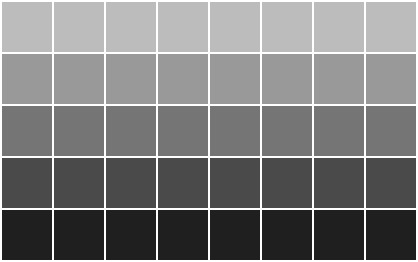
HTML
<section>
  <div></div><div></div>
  <div></div><div></div>
  <div></div><div></div>
  <div></div><div></div>
</section>
<section>
  <div></div><div></div>
  <div></div><div></div>
  <div></div><div></div>
  <div></div><div></div>
</section>
<section>
  <div></div><div></div>
  <div></div><div></div>
  <div></div><div></div>
  <div></div><div></div>
</section>
<section>
  <div></div><div></div>
  <div></div><div></div>
  <div></div><div></div>
  <div></div><div></div>
</section>
SASS
Para o loop, estou direcionando divs dentro de uma seção específica e determinando a ordem da seção usando ‘nth-child’. Dentro do loop, acabei de adicionar um atraso de 0,2 segundo para cada seção.
/* mixins to make our lives easier */
@mixin animation($name, $duration, $ease, $delay, $direction) {
  -webkit-animation: $name $duration $ease $delay $direction;
  -moz-animation: $name $duration $ease $delay $direction;
  -o-animation: $name $duration $ease $delay $direction;
  -ms-animation: $name $duration $ease $delay $direction;
  animation: $name $duration $ease $delay $direction;
}
@mixin keyframes($name) {
  @-webkit-keyframes #{$name} { @content; }
  @-moz-keyframes #{$name} { @content; }
  @-o-keyframes #{$name} { @content; }
  @-ms-keyframes #{$name} { @content; }
  @keyframes #{$name} { @content; }
}

section { clear: left; }
div {
  float: left;
  width: 50px; height: 50px;
  margin: 0 2px 2px 0;
  /* loop */
  $i: 0s;
  @for $level from 0 to 5 {
    section:nth-child(#{$level + 1}) & {
      @include animation(fade, 1.2s, linear, $i, both);
    }
    $i: $i + .2s;
  }
}

@include keyframes(fade) {
  0%   {background:rgba(0,0,0,1);}
  50%  {background:rgba(0,0,0,.5);}
  100% {background:rgba(0,0,0,.1);}
}
Equivalente CSS – gaah!
section { clear: left; }
div {
  float: left;
  width: 50px; height: 50px;
  margin: 0 2px 2px 0; }
  section:nth-child(1) div {
    -webkit-animation: fade 1.2s linear 0s both;
    -moz-animation: fade 1.2s linear 0s both;
    -o-animation: fade 1.2s linear 0s both;
    -ms-animation: fade 1.2s linear 0s both;
    animation: fade 1.2s linear 0s both; }
  section:nth-child(2) div {
    -webkit-animation: fade 1.2s linear 0.2s both;
    -moz-animation: fade 1.2s linear 0.2s both;
    -o-animation: fade 1.2s linear 0.2s both;
    -ms-animation: fade 1.2s linear 0.2s both;
    animation: fade 1.2s linear 0.2s both; }
  section:nth-child(3) div {
    -webkit-animation: fade 1.2s linear 0.4s both;
    -moz-animation: fade 1.2s linear 0.4s both;
    -o-animation: fade 1.2s linear 0.4s both;
    -ms-animation: fade 1.2s linear 0.4s both;
    animation: fade 1.2s linear 0.4s both; }
  section:nth-child(4) div {
    -webkit-animation: fade 1.2s linear 0.6s both;
    -moz-animation: fade 1.2s linear 0.6s both;
    -o-animation: fade 1.2s linear 0.6s both;
    -ms-animation: fade 1.2s linear 0.6s both;
    animation: fade 1.2s linear 0.6s both; }
  section:nth-child(5) div {
    -webkit-animation: fade 1.2s linear 0.8s both;
    -moz-animation: fade 1.2s linear 0.8s both;
    -o-animation: fade 1.2s linear 0.8s both;
    -ms-animation: fade 1.2s linear 0.8s both;
    animation: fade 1.2s linear 0.8s both; }

@-webkit-keyframes fade {
  0% {background: black; }
  50% {background: rgba(0, 0, 0, 0.5); }
  100% {background: rgba(0, 0, 0, 0.1); } }
@-moz-keyframes fade {
  0% {background: black; }
  50% {background: rgba(0, 0, 0, 0.5); }
  100% {background: rgba(0, 0, 0, 0.1); } }
@-o-keyframes fade {
  0% {background: black; }
  50% {background: rgba(0, 0, 0, 0.5); }
  100% {background: rgba(0, 0, 0, 0.1); } }
@-ms-keyframes fade {
  0% {background: black; }
  50% {background: rgba(0, 0, 0, 0.5); }
  100% {background: rgba(0, 0, 0, 0.1); } }
@keyframes fade {
  0% {background: black; }
  50% {background: rgba(0, 0, 0, 0.5); }
  100% {background: rgba(0, 0, 0, 0.1); } }